
New Client Launched : Cristen & Co.
/
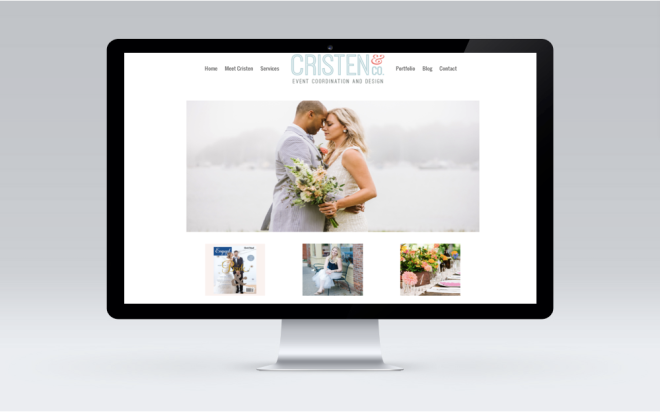
TYPE: Branding, Logo, Site & Blog CLIENT: Cristen & Co. Website: cristencandco.com Date: December, 2015
Cristen & Co. is a New England wedding design and planning company based in Massachusetts. Cristen approached us for marketing help and through the process we realized that a new brand was needed. Since we had already been working with her and her team, we had a good grasp on her work and ideal client.
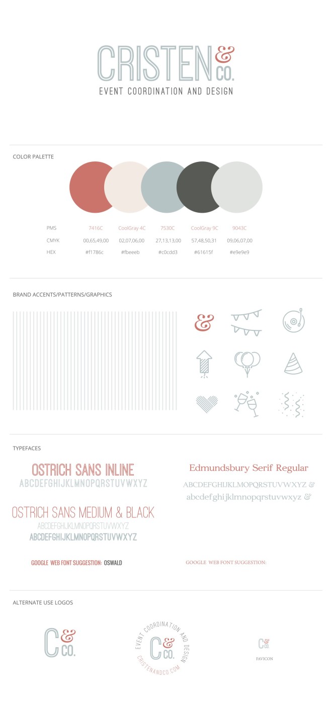
Tide Creative came on board to provide 360° Marketing support in the fall. {Brand, Logo, Website, Blog} Tide rebranded Captivatinly Chic to Cristen Co. and designed a new logo, website, blog and marketing materials. {Ad Buy} Under Tide’s management Cristen & Co. will be launching with ad campaigns on Facebook and Adwords.
Cristen summed up the experience on a new blog post: We worked with Tide Creative on this fabulous project and they really captured exactly how I wanted to portray Cristen & Co.. The logo design was on-point and our new brand color palette is amazing, lots of grays, slate blues and just the perfect pop of coral! And, I am going to be completely honest, J from Tide Creative and his team created our new brand, logo and website in about 1 month! YES, 1 Month! We fast-tracked our process because engagement season was right around the corner!! When we first started the discussion of the possibility of changing our business name we wanted to make sure if we went through with it that it would be completed around Thanksgiving! And, Tide Creative made that happen, I’m so thankful because I wouldn’t have been able to do it without them!
 For some awesome examples of websites employing responsive design, check out: http://www.fpmaine.com/, http://www.cairnevents.com/, http://www.thefritzfarm.com/. A great example of a mobile-friendly designis: http://www.loveandlobster.com/