How We Create A Brand Design
Brand design is more than a logo. It’s more than a brand style guide. It’s an essential way to differentiate yourself from your competition. A brand identity influences your customers’ experience at every touchpoint. It subconsciously affects how they view everything from your industry, to your relevance, to your trustworthiness.
It is the sum total of how your brand looks, feels, and speaks to them—the elements that help them decide if they want to engage with you.
Building a Brand Identity
Building that brand identity is no easy task. You need a solid foundation but flexibility, an identity grounded in your roots but looking toward your future.
It seems like a tedious process—and it can be. It requires deep thinking and foresight, but the results are well worth it. We’ve been through the process many times with our clients and our own rebranding.
To demystify the process for you, we’re sharing our creative approach to building a brand design, specifically the visual elements of a brand identity. If you’ve never been through the process before or think your brand identity could use a little updating, take note.
What Is a Brand Design?
This definition can be a bit murky. Is it your logo? Your color palette? The way you tone your images? To us, it’s the total composite of elements that shape how your brand is perceived. Some brand identities are tied to the practical elements: design, packaging, etc. Some even move into the realm of the senses: how it sounds, tastes, feels, and even smells.
For the purposes of this article, we’re focusing on the visual element of a brand identity. This includes:
Logo
Color palette
Typography
Iconography
Design system
Photography
Keys to a Good Brand Identity
A logo and a color palette alone do not make a brand identity. A good identity is well thought-out to make it:
Distinct: It stands out among competitors and catches your audience’s attention.
Memorable: It makes a visual impact.
Scalable and flexible: It can grow and evolve with the brand.
Cohesive: Each piece complements the brand identity.
Easy to apply: It’s intuitive and able to be applied on all marketing.
The Process Behind the Brand Design
When we begin a branding project, we approach each phase from a philosophical and highly critical standpoint. We want to inspect, poke, and prod until we get to the core of a brand. Then we get down to business. Here’s what that looks like.
1) Research & Discovery
This is hands-down the most laborious stage. It takes time, energy, and manpower. But it is crucial to build the foundation upon which the visual language will stand. In this stage, we learn everything we can about a brand. This research helps us create a brand persona, a comprehensive picture of what the brand is. To do this, we ask many questions.
Who is the audience?
One common misconception is that a brand design is exclusively informed by what a brand wants to present. This isn’t entirely true. We also need to understand what a brand’s customers want to engage with.
This doesn’t necessarily mean that the brand’s customers will choose the logo color. But it means we get a solid understanding of their needs, wants, and values. We understand the personas in the wedding world, so much of that research is part of Tide’s DNA.
Beyond a brand’s primary audience (customers), we also want to know what secondary or tertiary audiences it may reach (e.g., other brands or potential employees). A brand design is the “face” that interacts with the entire world. Whatever we create should accurately reflect what the brand wants to do and say to particular people.
They don't need to know your "what", they need to know your "why".
What is the existing brand?
Sometimes we’re building a brand identity entirely from scratch. Other times we’re updating a stale identity. Either way, we need a full assessment of:
The current state of the brand’s design
How that brand design might be crafted or tweaked to align with goals going forward
We want to know how the brand is perceived, both internally and externally. Getting an honest and accurate reflection is the only way to understand how and where it’s succeeding or where we need to move to correct.
Who is the competition?
Building a brand design is all about differentiation: making a brand visible, relevant, and unique. Without a firm understanding of the competitive landscape, it’s easy to blend in. This research is crucial to understand not just who the competition is but how the brand compares, in perception and presentation.
As such, we analyze the competition, as well as the industry. We look specifically at how competitors present themselves in terms of common visual elements, trends, pricing, workflow, brand personalities, etc.
2) Visual Ideation
By this time, we have a ton of information to help inform ideation. Between competitive analysis, on-site feedback, and our past experience we will already have a good idea on visual elements.
The information we father is often steeped in emotional language about the brand’s personality, goals, and values. Now the challenge is to figure out how to communicate and enhance those sentiments through visuals.
We tackle this by bringing in our team to brainstorm.
We then select specific elements that elicit the strongest emotional response, trigger additional imagery, and help us build a visual foundation to work forward from.
3) Production
After so much homework and brainstorming, now our designer gets to start the real fun.
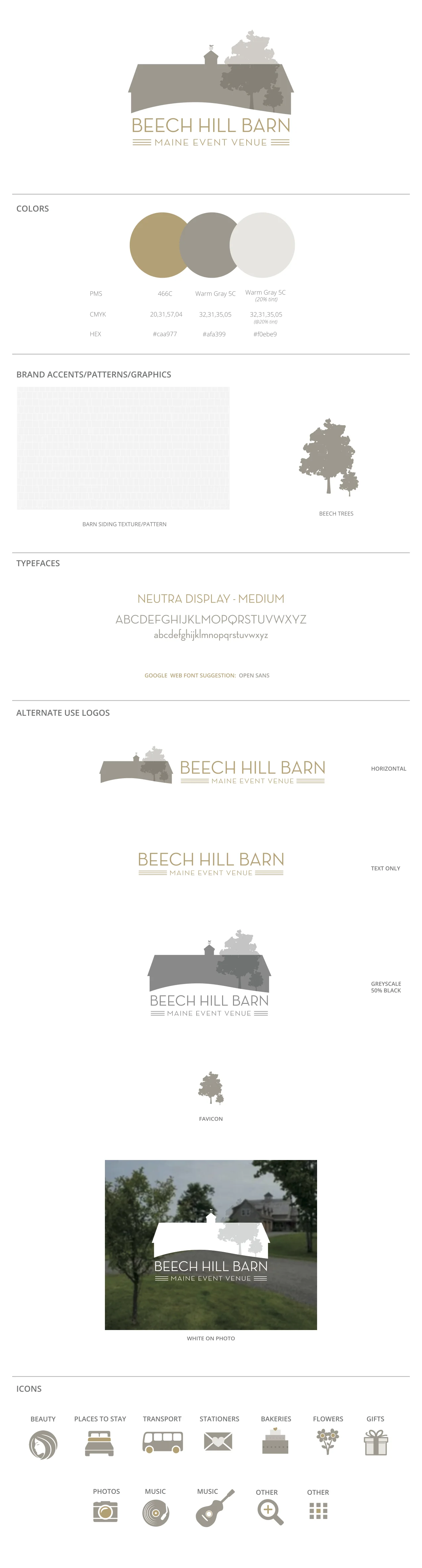
Logo
As we go through iterations, we flesh out logo mark, core shapes, and complementary imagery. As we receive feedback and iterate, we want to make sure that the core imagery is powerful enough to deliver the message on its own, typically without the enhancement of color. [see if Alina has an example ofdifferent phases of a logo we designed]

Color Palettes
Once we have solid visual imagery, we explore color. Certainly, emotion plays a huge roll in color choice. This is also, as previously mentioned, a good chance to differentiate.
A good color palette is clean and flexible, supplying designers enough choices to be creative but not enough to overwhelm. This includes primary, complementary, and accent colors.

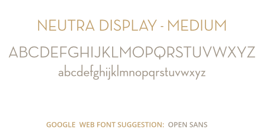
Typography
Every stage has its own unique challenges, but typography can be tricky in a visual language. Brands often follow trends (serif vs. non-serif) that are hot for a second but can quickly become dated or appear unoriginal. We often find ourselves pushing back against certain requests.
We believe branding is like building a house. Each element is built on top of the other. Therefore, typography should be informed by the shapes of the logo. You’d think it’s a simple choice, but typography is just as emotional as anything else. It needs to communicate the brand persona effectively.
We limit the number of font families to 2-3. This generally includes a primary brand typeface, then secondary typeface(s) for specific purposes based on where it will be used, such as a body copy and website headings.
Iconography
Good iconography is influenced not just by the creative visual language but by the applications for the work. It depends on what the product or service is, the industry, and the medium.

Design System
Hierarchy & layout: The proper order of content, including headers, sub-headers, body copy, images, blurbs, etc.
Photography: Where, when, and how to use photography, including guidance on filters and treatments.
Appropriate logo use: Guidelines for how the logo may be modified, including examples for reference.
4) Building The Brand Style Guide
The only thing more heartbreaking than a poorly designed brand identity is a beautifully designed identity that is never used or used incorrectly. A brand style guide is the savior here—if it’s crafted the right way.
We include clear, easy-to-follow guidelines for every part of the brand identity, including examples and use-cases. This also includes practical detail, denoting as much information as needed to help the user replicate the brand identity successfully.
Keep Your Brand Design Strong
A strong visual language should always reflect your brand. Whether you’re totally overhauling your brand identity or you’re just starting out, strive for consistency and look for ways to apply good design at every level of your organization.
Costs
The range for a brand design is $2800-6000!
Typical clients pay $4200.
Recent Brand Style Guide
Schedule a Brand Consultation